Custom Classes for Card Images
This article details a number of built-in custom classes that affect the display of images in the Cards widget.
By default, cards look like this:

It helps to understand that images will cover the space for the image which, by default, has a height that is 50% of the width.
noimage
Hides the images

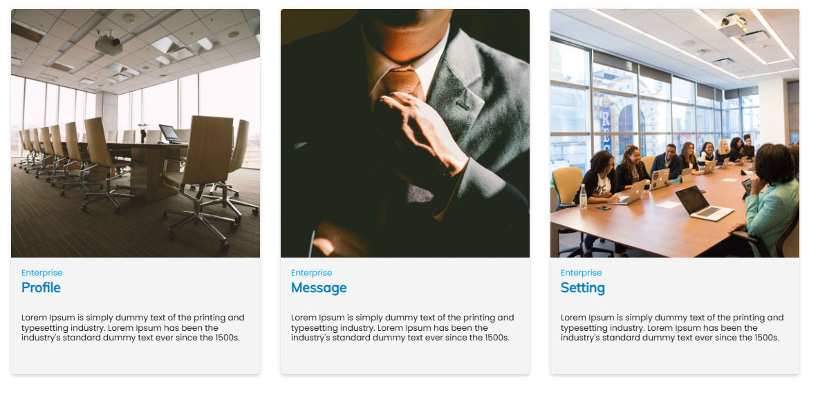
squareimage
Displays the images at an aspect ratio of 1:1 (100% height)
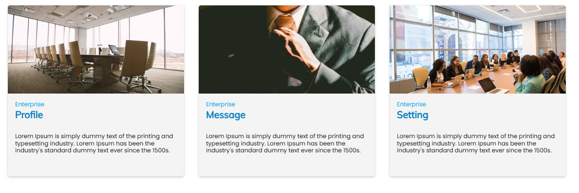
landscapeimage
Displays the images at an aspect ratio of 2:1 (50% height)
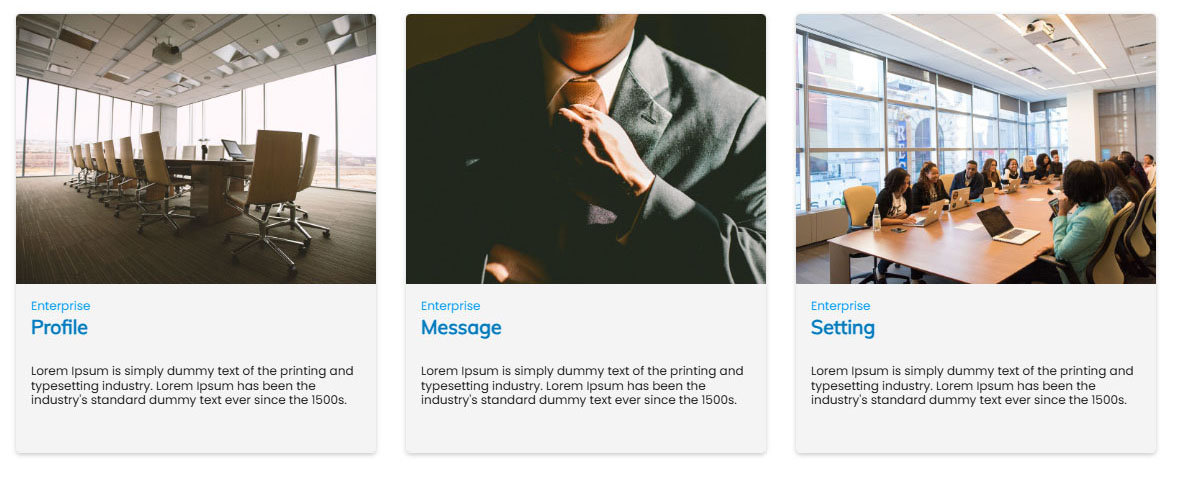
tvimage
Displays the images at an aspect ratio of 3:4 (75% height)
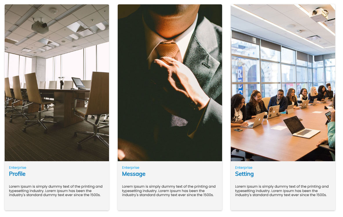
portraitimage
Displays the images at an aspect ratio of 1:1.2 (120% height). Good for people profiles.

tallerportraitimage
Displays the images at an aspect ratio of 2:3 (150% height). Good for people profiles.
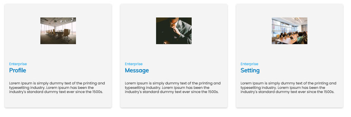
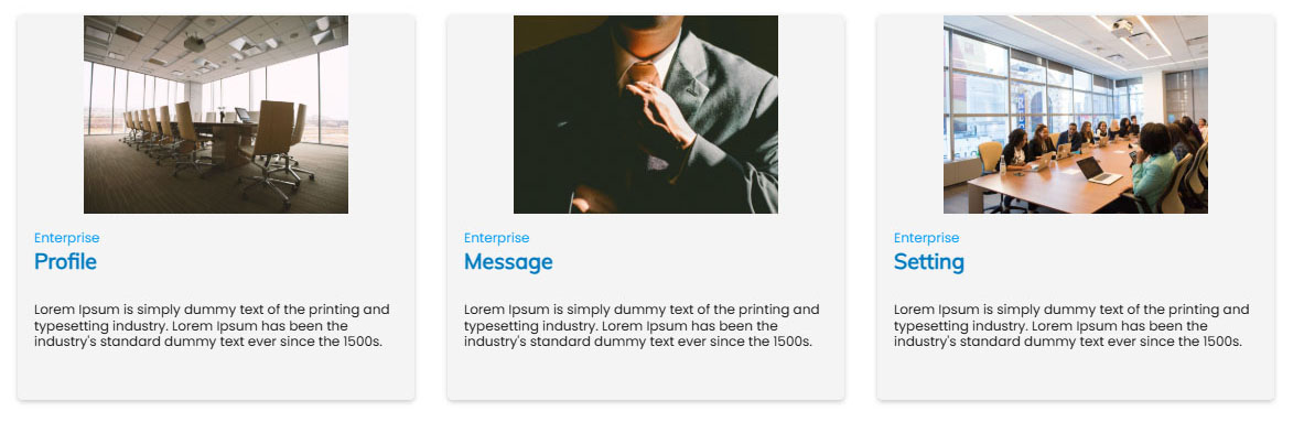
containimage
Displays the full image without covering the space. Good for logos and icons.
halfwidthimage
Displays the full image with 50% of the width.
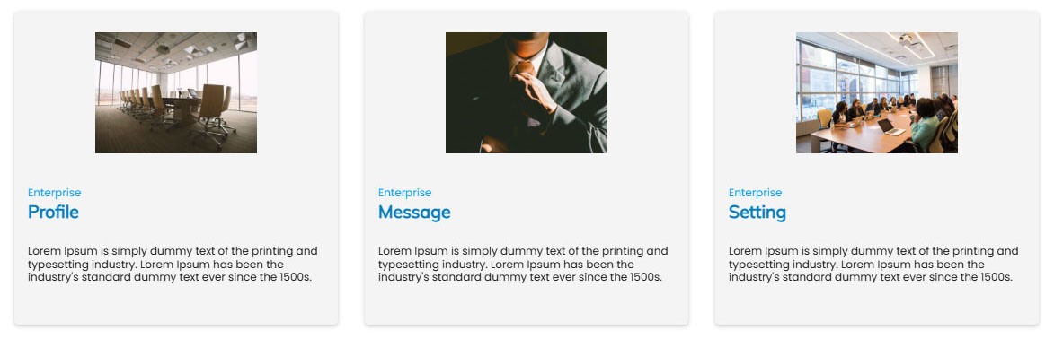
halfheightimage
Displays the full image with 50% of the height.